| Map > Data
Science > Explaining the Past
> Data Exploration >
Bivariate
Analysis > Numerical & Numerical |
|
|
|
|
|
|
Bivariate Analysis
- Numerical & Numerical
|
|
|
|
|
|
Scatter Plot
|
|
|
|
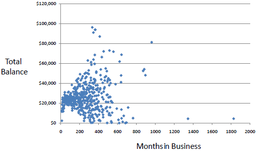
A scatter plot is a useful visual representation of the relationship between two
numerical variables (attributes) and is usually drawn before working out a linear correlation or fitting a regression line.
The resulting pattern indicates the type (linear or non-linear) and strength of the relationship between two variables.
More information can be added to a two-dimensional scatter plot, for example, we might label points with a code to indicate the level of a third variable.
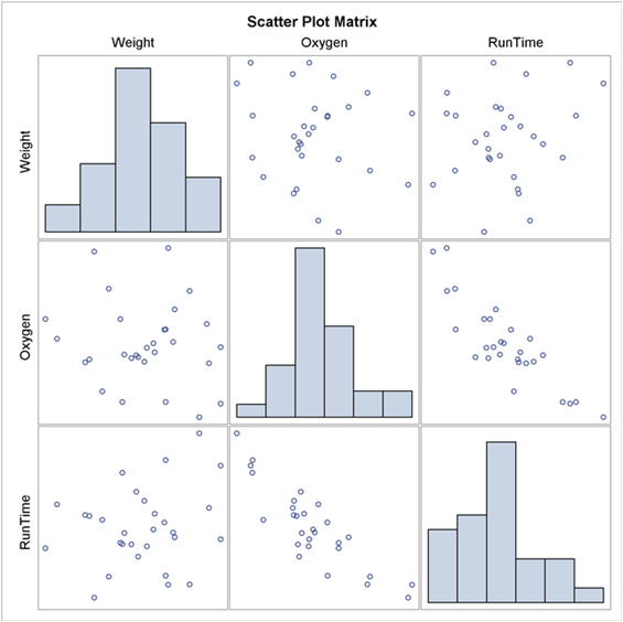
If we are dealing with many variables in a data set, a way of presenting all possible scatter plots of two variables at a time is in a
scatter plot matrix.
|
|
|
|
|
|
|
|
|
|
|
|
|
|
|
|
|
|
|
|
|
|
|
Linear Correlation
|
|
|
|
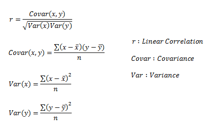
Linear correlation quantifies the strength of a linear relationship between two
numerical variables. When there is no correlation between two variables, there is no tendency for the values of one quantity to increase or decrease with the values of the second quantity.
|
|
|
|
|
|
|
|
r only measures the strength of a linear
relationship and is always between -1 and 1 where -1 means perfect negative linear correlation and +1 means
perfect positive linear correlation
and zero means no linear correlation.
|
|
|
|
|
|
|
|
Example:
|
|
|
| Temperature |
83 |
64 |
72 |
81 |
70 |
68 |
65 |
75 |
71 |
85 |
80 |
72 |
69 |
75 |
| Humidity |
86 |
65 |
90 |
75 |
96 |
80 |
70 |
80 |
91 |
85 |
90 |
95 |
70 |
70 |
|
|
|
|
|
|
|
| |
Variance |
Covariance |
Correlation |
| Temperature |
40.10 |
19.78 |
0.32 |
| Humidity |
98.23 |
|
|
|
|
|
|
There is a weak linear correlation
between Temperature and Humidity.
|
|
|
|
|
|
|
|
|
|
|
|
|
|
|
